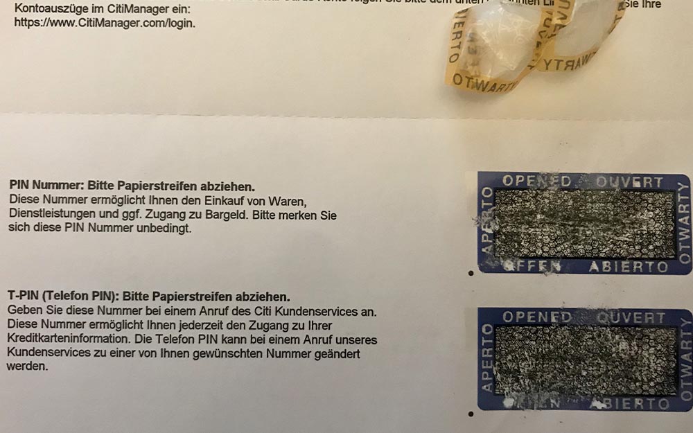
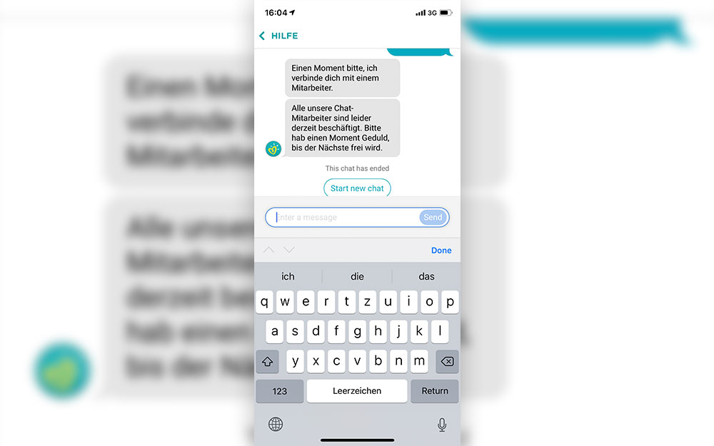
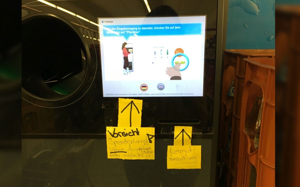
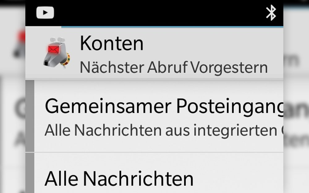
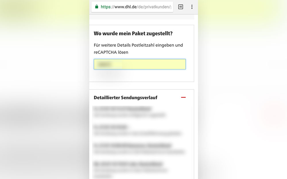
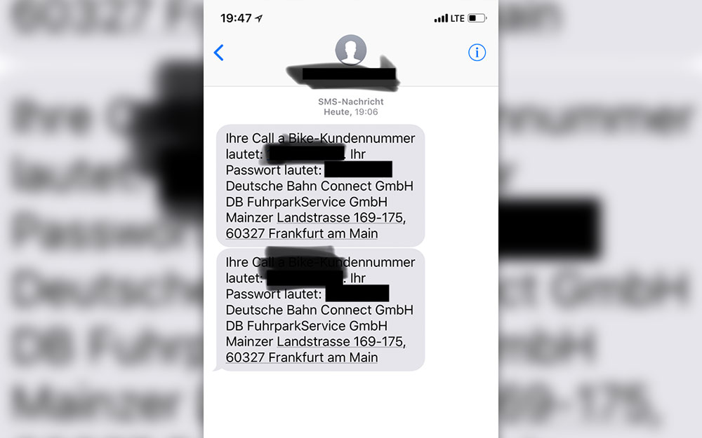
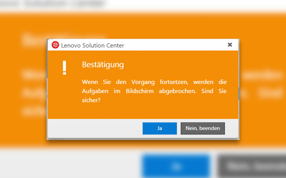
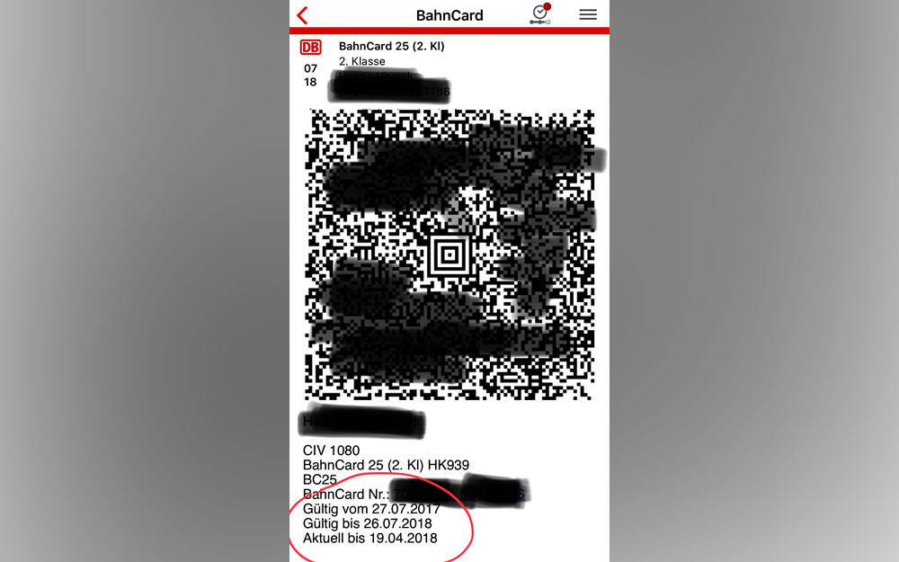
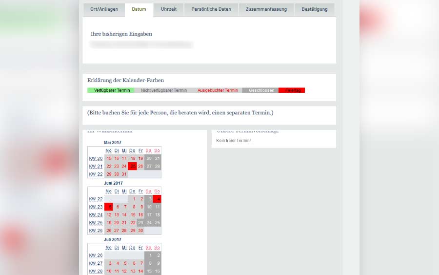
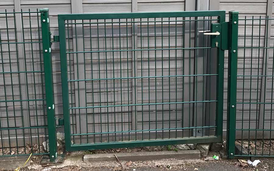
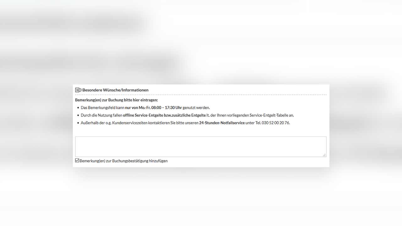
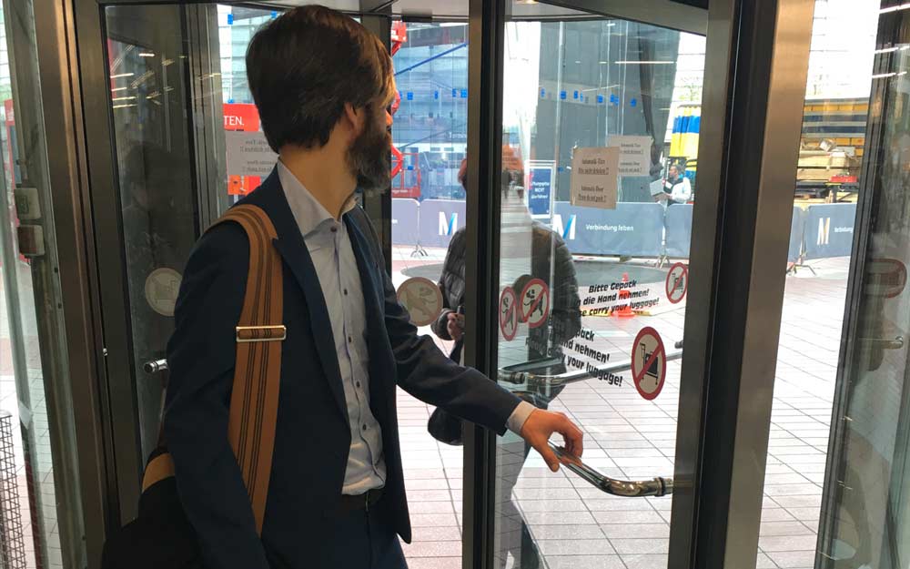
April 3rd, 2012 | Tags:

Architecting user experience entails the big work of carving out spaces for users to work within, but the tiny little details that matter just as much. For this reason, I love http://littlebigdetails.com/ as a source of inspiration, and it reminds me of one of my favorite little big details.

As a bicyclist, I love weather radar maps that help me guess when storms will break. Weather.com’s radar map now has little tips that appear when I hover, giving me the precise level of zoom I want. This is even better for my particular use case, because sometimes I want to know within the next 15 minutes whether I can bike out (street level), or within the next 4 hours whether I can bike out (state or country level).

March 9th, 2012 | Tags:

I’m a published author! My article “In Defense of Doing it the Hard Way” has been published in the Interactions March+April issue as part of the Evaluation and Usability Forum. ACM allows me to post a version in my personal collection as well, so here it is!

The job of a user-research professional is undoubtedly a hard one. Understanding problems, getting the right sample of people in our labs, extracting insights from data, and evangelizing the user’s needs can make for challenging work. At the same time, rewards abound in this profession: the joy of diving into a new topic, engrossing conversations with some of the hundreds of people that pass through my lab, and of course the aha moments—those glimmers of awesomeness alone more than make up for any difficulties. But every now and then I wish it were all a little…easier.

In the heat of the workweek, I’ve been tempted by quick fixes and shortcuts. A glance at the battlefield of user research tells me I’m not alone. It seems as if every week I read about some paradigm-shattering new tool that promises to blow my mind, crunch all of my data by 5 o’clock, and have dinner on the table by 7. Tools like these are often pitched to us, an eager audience of open-minded, tired, bored, inexperienced, or budget-starved user-experience evaluators.

These promises are rarely fulfilled. I still end up spending hours hunched over my computer, or I don’t get the insights I was hoping for, or the quality of my work just plain suffers. After many failed experiments, I’m starting to think that these gimmicks and borrowed techniques from other fields amount to shortcuts, and shortcuts are not exactly formulas for success. Worse, I’m concerned that the quality of our work as a whole suffers: Every time we cut corners, we deliver subpar work that waters down the value that user research can offer.

We might not intend to skimp on our work, or we might feel pressured to cut corners in our quest to deliver more work more quickly, but no matter how you slice it, shortcuts aren’t actually doing us any favors. Shortcuts don’t help us produce good work, and if we strive to produce good work, shortcuts don’t actually save time. We have to do it the hard way.

What Do Shortcuts and Cut Corners Look Like?

Let’s get something out of the way first: When picking on shortcuts, I’m not targeting appropriate guerrilla user research. I have no issue with designers or one-man bands who just want to know how to improve their products. They don’t need to do it the hard way, and when they are ready to do it the hard way, they’ll approach their work differently, either by learning new skills or bringing in a seasoned researcher.

Rather, this discussion is intended for people whose primary focus is user research, day in and day out, whose job is to learn more about users and to understand their context. Solid user research requires both sweat and diligent work. Whether we are in the lab running usability studies or out in the field conducting ethnographic research, our core value as user-research professionals lies in our deep understanding of context, our analytical skills, and our ability to bring empiricism into the product-development process.

To put it another way, user-research professionals get hired not just because we are good at excavating truth, but also because we have a knack for mapping the knowns and unknowns around those truths, finding new points to investigate, and communicating the core truths that we learn in a way that’s helpful and productive. When we do that, we can help a design plow all the way to the other end of development, through shifting requirements and slippery scopes, without ever losing focus on the needs that the design was built to address.

It’s our job to ensure that rigor backs our process, and that we are actually being as precise in our measurements as we think we are. Unfortunately, in our line of work there are many opportunities to deceive ourselves into thinking we can save time, energy, or money without sacrificing the precision and accuracy of our work. Anything that doesn’t require much sweat, plodding, or careful attention to detail is a shortcut, whatever form that shortcut may take. Sometimes a shortcut promises to reduce the amount of time we spend planning and executing studies. Other times a shortcut claims to make analyzing data easier. Still other times, a shortcut takes the form of a misapplied tool.

The Shotgun Shortcut: Executing Studies Ineffectively

Generally, the greater the amount of time that a shortcut claims to save me, the more suspicious I am of the shortcut. A case in point: I’m highly suspicious of unmoderated open card sorts, in which remote participants are given a heap of cards and asked to sort them into categories and label the categories. Hosting card sorts online saves time and resources by allowing users to complete them at their leisure and without need for professional attention. However, this adaption comes at a cost. It sacrifices the main benefit of that particular research methodology, namely access to the rich, qualitative verbal report from our participants that helps us understand the way in which they construe the world. With this understanding, we can address the why of things. Unmoderated card sorts can’t give you this why; they can give you only the what and the when.

One rebuttal is that if we run a large enough sample, we can call it quantitative data. But this is still qualitative data; in adapting this methodology poorly, we lose its intent and its strength. When we mechanize it and remove that ability to follow our participant’s train of thought, we shove all that beautiful qualitative data into a quantitative box. The result is a monster pile of data, stripped of context and of any good foothold from which we can understand what these categories and labels mean to the user and their work.

I have put online card sorting to good use before, of course: in validating a preexisting idea. Only after I’ve interviewed enough people and had in-person sorts and developed a prototype of a navigation tree can I bring the online card sort out of the toolbox and test the ideas I’ve come up with. The context and the why are still missing, but that’s not what I’m trying to get at in this particular study. I fill in those in gaps by triangulating data collected from other studies. Of course, once we undertake the difficult task of piecing together data from different sources, we are no longer cutting corners.

The Drive-by Analysis Shortcut: Skimping on Thinking

From fear of analysis paralysis (spending too much time poring over data, needlessly turning over stones, and beating long-dead horses), we can swing to the other extreme and rush through analysis. I have learned that when something does need to be examined thoroughly, nothing can substitute for the grunt work of teasing out answers and squinting our eyes to see if the puzzle is yet complete.

Web analytics readily fall into this trap. They are indispensable and you will have to pry them from my cold dead fingers, but they are stunningly easily to screw up. Here is a basic example that many of us have grappled with: “Time on page is up 20 percent since last month!” If we take statistics like these at face value, we might consider it a win, but we need to dig deeper to figure out what the numbers mean. What kind of design changes have we made since then? Do people spend more time on that page because it takes longer to get stuff done? Did our South Korean users abandon us, taking with them their stunningly high-speed Internet? Increased time on page is just one of many deceptively simple numbers that, without context, raises more questions than it answers.

No single bit of analytics data can stand by itself, and analytics is at its most powerful when it’s part of a holistic picture of users, their goals, and their environment. When we bring together insights from other qualitative and quantitative studies, our understanding of the truth sharpens. Because of this, I approach analytics in much the same way that I approach salt: as an essential seasoning to (almost) every main dish.

For example, while planning an in-person usability test, I first sniff out the goals of the study and what we need to learn, and then find ways to season those questions with analytics. If we’re concerned that a new form field will frustrate users, before we conduct a usability test we compare before-and-after numbers on form-completion rates, exit page destinations, and time on page. This helps identify things to watch for in the lab. If analytics show a pattern of folks heading en masse for the “about our company” link, we can keep a special eye on our in-person participants’ behavior and expectations around that link.

At the end of the day, our job is to solve problems. Analytics, like anything else, is a means to an end. Taking an iterative, systematic, and rigorous approach to problem solving yields a clearer connection between the problem, the research done around it, and the design that gets to the root of the issue.

The Square Peg in a Round Hole Shortcut: Using the Wrong Tool for the Job

After moving to a new apartment in an unfamiliar part of town, I drove to work using a familiar route that added five miles to my daily commute. I did this not just once or twice, but every day for over a month. I vaguely knew that there was another road to town, but I was afraid of getting lost, so I didn’t venture out of my comfort zone. In user research, it’s also tempting to stay inside our comfort zone and stick to tried-and-true methodologies even when they are not appropriate for the job. I’ve watched professional user researchers adapt them, stretch them, and hack them together with other methodologies. Inevitably, these “franken-methodologies” resemble a snake with legs stapled onto it, sadly attempting something for which it was never built.

We are not always as careful as we should be when planning research. Once we have identified a research need, it’s fantastically handy to have a wide range of tools and approaches to pick from to address that need. However, different tools answer our questions from different angles, and sometimes we simply pick the wrong angle, ending up with empty or inaccurate answers. All methodologies bias research in some way; when we understand what our bias is, we can take steps to address it. Because of this, it’s essential to understand the strengths and weaknesses of our tools, and what implications that holds for our results.

And here’s a good example: Eye tracking, in all of its popular glory, is a notoriously misapplied methodology. Eye-tracking technology monitors where and for how long people’s eyes fixate on a target. The original idea back in the day was to learn how people read and to correlate eye fixation with cognition. It was long the exclusive tool of labs with very deep pockets, but times have changed, and at UX conferences these days you can’t throw a rock without hitting an eye-tracking vendor. These vendors claim to deliver the power of the eye-tracking lab at dirt-cheap prices. Eye-tracking presentations and seminars (often given by said vendors) spring up like weeds, offering “eye-tracking 101” and “eye-tracking boot camp.” It’s not so expensive, they promise, and not so hard. Anybody can do it.

Great! What’s the catch? Well, eye tracking in UX is based on the premise that the resulting heat maps will reveal thoughts that users don’t verbalize, because they are not conscious of their attention processes. Unfortunately, the heat-map data does not actually represent the user’s mental processes. Like chocolate cake, you have to bake it before you eat it. Cognitive scientists understand this. When they use eye-tracking studies to learn how we process information, they actively take account of all relevant work, no matter the methodology or the discipline. When vendors promote eye tracking as easy and accessible, they gloss over that work, and because the heat maps look scientific, we fall for it.

It’s easy to understand why eye-tracking maps are so easily mistaken for findings. Humans intuit that data is messy, so if it looks nice, it must be analysis-ready. Unfortunately, because eye-tracking is so deceptively easy, it enables enormous fallacies in user research. It’s marvelous at proving other people wrong (“See, I told you green wouldn’t work”), proving our own points (“If the button were red, people would see it”), drawing shaky conclusions (“It’s not that people don’t want to use it, it’s that they don’t see it”) and discrediting our profession (“This isn’t so hard. Remind me again why we’re paying an expert to do this?”).

Like the other shortcuts I’ve mentioned here, eye tracking gives a dangerous amount of latitude for anybody to make their own guesses and draw their own conclusions. Eye-tracking data seems very approachable, and it looks fun to play with. However, its data is stripped of all meaning and context, and when we take it at face value, we run the risk of drawing unsubstantiated conclusions. Unfortunately, our clients may also mistake eye-tracking data for insights, and it’s our responsibility to ensure that they don’t draw unsubstantiated conclusions either. Our clients (who are not trained in the fine art of considering data in a holistic context) need solid information to make solid business decisions. In supporting that need, we must ensure that our insights are rich and that they provide information our clients can trust.

Certainly, eye-tracking studies can be used constructively in our research. But this requires them to be carefully written, carefully moderated and observed, and very carefully analyzed. The results must be situated in an existing understanding of the user’s intentions and workflows. In short, a successful eye-tracking study calls for a skilled practitioner with a sixth sense for subtleties.

And really, if you’re that good at making sense of patterns of user behavior, you probably don’t actually need eye tracking to succeed. Everything that you can learn from eye tracking at this point you can learn using simpler, cheaper methods. If you actually do all of that work, it’s no longer a shortcut. You’re back to doing sweaty labor.

What Can We Do, Then?

These are pitfalls for new and seasoned user researchers alike. Folks new to the field, including those transitioning from research in guerrilla-style environments, might inappropriately adapt techniques they already know, or they might address weak points in their research by Band-Aiding over them. Seasoned practitioners might tire of dealing with stakeholders who don’t care about deep, rich data, so they might look for ways to develop more insights faster, or yield to bad compromises.

Shortcuts, in all their varied and sneaky and tricky disguises, can entrap anybody along the entire spectrum of experience and cause our work to suffer. Even if our enthusiastic adoption of shiny things distracts us from noticing the weaknesses in our research, others will notice the problems. This seed grows into distrust of our individual work and has the potential to scatter seeds of distrust of the user-research profession.

Many shortcuts share the shiny allure of modern, sophisticated-looking technology, but in the end they are a poor substitute for our critical-thinking skills. They might look good, but they are compromises, and they don’t replace the fundamental skills we should be developing. These skills are not new; they are the skills polished by curious people across all scientific fields: Once we have made an observation and defined the problem, we form a hypothesis and test it. Those skills take a lifetime to perfect, and when we are neck-deep in fads, we can’t hone them. We might suffer the illusion that superficial understandings will suffice, and we might conclude that our restless minds are at their sharpest when wielding the newest of an endless series of gadgets, but in reality we’re letting the best things about us—our curiosity and our intellect—waste away.

This is perhaps the saddest thing about shortcuts. While we’re leaping from gimmick to gimmick, we forget the reason we started poking around and asking questions and knitting our brows in puzzlement. We forget about the basic human need, as old as the wheel, to understand the world and its people. This is a huge undertaking. We should do it right.

About the AuthorLeanna is the User Research Coordinator at ITHAKA and a problem-solver by trade. As part of her calling to create holistic and delightful experiences, she manages research studies, conducts social experiments on teammates, and juggles between quantitative and qualitative analysis.

© ACM, (2012). This is the author’s version of the work. It is posted here by permission of ACM for your personal use. Not for redistribution. The definitive version was published in Interactions, VOL19, ISS2, (March + April 2012) http://doi.acm.org/10.1145/2090150.2090168.


March 4th, 2012 | Tags:

Just a small reminder that the best solution isn’t always something fancy.


Taken at the Muskegon Subway.

February 20th, 2012 | Tags: , ,

The wonderful thing about travel is that it constantly reminds me that culture seeps into everything. Culture is everything.

In Dublin, seeing the “Favourite Fried Chicken” restaurant made me chortle. Why? Because fried chicken is an American thing, and with that spelling, you can bet the owner isn’t serving authentically Southern fried chicken. The owner and proprietor of that restaurant either didn’t consider the cultural context (grabbed an idea at face value), or doesn’t have access to that cultural context (hasn’t spent enough time in Georgia).

Churros con chocolate, or little fritters dipped into hot chocolate.

In the United States, "churros" are served in high-end tapas bars. Not so in Spain - they're served at kiosks, I guess? After a week of intensive research, I still couldn't reliably find hot, delicious, fresh churros.

In Spain, I saw a bar called “The Irish Tavern”. There’s no such thing as an Irish tavern. There are Irish pubs, which originated as public drinking houses. Instead of appealing to the homesick, it serves as a giant red flag that the owner doesn’t understand what makes an excellent Irish pub. There will be beer, but what kind? will there be music? will it be sociable? Probably not. I’ll just go have some tapas instead.

Context is everything. Culture is everything. Everything is culturally situated. By “culture” I don’t just mean “east vs. west”, or “American vs European”, but I also mean all the different, weird, wonderful, teeming cultures that we engage in every day. A heavy metal concert reflects one type of culture. Someone rocking out at that concert may get up early the next day and put on a suit to enact another type of culture. Culture is a shared set of attitudes and meaning that a group works within, and cultures are everywhere.

Understanding cultural context and wielding that understanding is essential in the practice of user experience. Take deliverables. The sprint team loves sketches. Should you give a rough sketch to an executive as a strategy document? Well, obviously not. But should you give a sprint team a polished 50-page strategy brief during a sprint planning session? That’s an equally egregious failure to understand cultural context.

What about usability findings presentations? I give at least one internal presentation every week, sometimes to small teams, sometimes to the entire company, sometimes to small bands of business line owners. A little while back, I gave an internal presentation to 300 people. It was an FYI-style summary of usability findings with an invitation to contact me with questions. I then gave the same FYI-style presentation to a band of product owners. Did that go well? Nope. Cultural context is everything.

How about the user experience strategies you create? Let’s say you’re working for a funky shoe company targeted at teens. Your company would like you to embed promotions for the Twitter account around the site, using it to push coupons and specials to your consumers, these teenagers. Sure, you can do that, but that’s the least of your worries. The first question you should ask is: Will that work? Hmm, maybe, but it’s complicated. danah boyd – a leading scholar on youth culture – highlights some of the questions you’d have to ask about teens and Twitter: what kinds of teens are they? geeks? celebrity followers? are they American? It’s only after exploring the cultural context that tweeting teens navigate that you can put together a meaningful Twitter strategy (or not).

Cultural context is everything.

One of my very favorite Interaction’12 talks was from Eric Dahl, on the topic of cultural design. Eric puts it beautifully in the blurb for the talk:

The products and services we design and deploy are embedded within a culture and not just a context. Culture is an important concept that is often overlooked by designers. We need to think beyond user’s goals, needs, desires, emotions, context, psychology and principles of design; we need to start designing from a place of culture.

Another thought-provoking resource on culture is F.S. Michaels’ Monoculture: How One Story is Changing Everything. BrainPickings has a good write-up summarizing the central premise of the book here. It argues that our overarching culture serves as a template from which we tell stories about ourselves, others and society. Although it doesn’t delve much into the microcultures we participate in (which is more in the realm of interest to user experience practitioners), it’s worth reading.

What cultures do the people you’re designing for participate in?

February 18th, 2012 | Tags:

I’m back from Interaction12 in Dublin. It was an absolutely lovely conference. It was incredibly social and friendly, with lots of opportunities to meet new folks and hang out with them, and the topics were also well-chosen. And man, the closing plenary by Genevieve Bell was awesome. I’ve been a fan of her work for years and it was great to finally see her talk. Can’t wait till that video is available.

I also gave a brief talk at Interaction12 about how we grow and mature UX talent. User experience is a craft (this argument has been well made elsewhere, so I’ll leave it at that), and I argue that we should take the training and grooming of incoming UX professionals as seriously as guilds take the training and grooming of apprentices.

There will be video of all the Interaction’12 talks, which I’ll post that when it’s available. In the meantime, my slides are up.

The Craft of UX

I’ve also run into some other thought-provoking resources on the topic:
January 26th, 2012 | Tags:

When the opportunity arose to write an article for Interactions Magazine’s Usability & Evaluation forum, I jumped at the chance. I’ve just sent off the final edit, and I’m very excited.

In short: I’m about the shortcuts, intentional and unintentional, that we take as overwhelmed and busy user experience researchers. In this piece, I lay out what these shortcuts look like and how they undercut the quality of our work, and I argue that there is no substitute for good, old-fashioned critical thinking. Keep your eyes peeled for it in the March/April 2012 issue!

January 18th, 2012 | Tags:

I’ll be giving a presentation at Interaction ’12 in Dublin in just two short weeks! Here’s the brief:

What do bakers, metalsmiths and user experience professionals have in common? They’re all crafts, but unlike other crafts, UX doesn’t have a mentality of apprenticeship and practice. I argue that because UXrequires broad knowledge across a number of disciplines, practical experience, and people skills, simply getting a degree and attending conferences isn’t enough. If we want the UX field to grow and mature, we should re-think how we grow and mature incoming UX professionals.


Where’d this come from? Well, I’ve been noticing that as newbies, we’re not getting the experience we need, and as employers, we’re not getting the people we need. I found the guild system fascinating and inspiring, and I think we have a lot to learn from such a framework. If you’re interested in talking about what we can do in our everyday jobs to help grow talent, please do track me down. And if you’ll be in Dublin, let’s chat about it over a beer.

September 9th, 2011 | Tags:

Us UX practitioners are a fidgety bunch. We love our office supplies. We love our whiteboards, our post-its, and we adore our sharpies. We love hands-on workshops, and we prefer to analyze problems in ways that we can see and touch them. It shouldn’t be a surprise to me, then, that I’d forgotten the value of focused, undistracted thinking. No tools, no props, no fiddly fidgety office supplies.

Rodin's Thinker

This realization came about quite accidentally. I moved a bit further away from work, and now my bike ride to work is 10 miles one-way. I love this ride, but one of its unexpected side effects is that every day, I have two full hours to think. There’s enough scenery and low-level attention required that I’m not going to fall asleep, but for two hours, my mind wanders, and since I’m usually going to or from work, I think about work a lot.

And I’ve discovered that my brain can do a lot of work without writing notes, making diagrams, or planning. My brain’s strength is in thinking things through and following trains of thoughts without commitment, and when I write things down, that’s an implicit commitment. When I plan, sometimes that’s an implicit procrastination of thinking a problem through. The end result is that more often than not, I arrive at work ready to get started and to put into action the things that I’ve mulled over, and I’m more confident that I thought something through.

Here’s your challenge: find as little as 10 minutes or as much as an hour to sit somewhere away from computers, notebooks, sharpies, food, drink, fiddly objects. For that entire time, just stare off into space and mull over a problem. Don’t rush, and don’t try too hard to find a solution before your time is done. Just ponder. And then when you’re done, go back to your workspace and turn your thoughts into reality. I bet you’ll be surprised with how good whatever you came up with is.

May 20th, 2011 | Tags:

At the IA Summit, I gave a talk about how to up your game as an information architect. It was my very first conference talk and a very exciting experience!

fresh-faced newbie IA!

I initially proposed this talk because as a fresh-faced newbie IA with a little more than a year of work under my belt, I’d attended a recent run of frustratingly uninformative UX conferences that seemed both repetitive and self-congratulatory. In fact, since I’ve graduated, I’ve needed to learn a bevy of new skills that I wasn’t taught in school and that weren’t covered in the professional events that I was attending.

To be specific, I was doing fine carrying out UX work like running usability tests and wireframing, but in the nuts and bolts of making my work relevant and actionable, the things that helped me out the most were not always part of the information architecture / user experience canon. Things like statistics, business savvy, interpersonal relations, narrative fiction, and psychology really helped me up my game. I’m not dismissing the value of existing UX resources at all, as we need to know these foundational things in order to do our jobs, but when it comes to the day to day work of analyzing some data or smoothing things over with a stakeholder, I don’t find enough guidance and help from UX to get by.

It seems clear to me that user experience professionals need to talk about subjects outside of the traditional UX canon more often, and I’m not entirely sure why we aren’t. Our field is very well-grounded in other disciplines; many of us got our educations in entirely unrelated fields. I asked the University of Michigan’s School of Information for some data on what the current class of human-computer interaction students were majoring before they came to the school of information, and the results were not surprising, but very interesting. Here’s a word cloud – click for a larger version.

undergraduate IAs

We’ve got a staggering variety of backgrounds to draw inspiration and knowledge from, and to help us improve our work, but as far as I can tell, we’re not really talking to each other about it. Why not? Are we discrediting the usefulness of these backgrounds, or assuming that other UX professionals wouldn’t be interested in hearing about them? If something we learn from statistics bails us out in a work situation, do we assume that every workplace is unique and it was a one-off? Or are we reluctant to take on a teaching and mentoring role for things that we don’t do for a living? In any case, I’m concerned that UX may struggle to grow and mature as a profession if only reaches inward for insight and inspiration. We need to start stealing the best nuggets of wisdom that we can find from everywhere, even from the most unlikely disciplines, and to be inspired by the world.

For me, this means that I’ve got my eyes wide open for anything and everything that might help me up my game. I’ve found inspiration in unlikely places. Gaining a deeper understanding of statistics has been immeasurably helpful when I need to juggle analytics to convince stakeholders of a design decision. Understanding how the world of business works and knowing how to approach stakeholders and have difficult conversations has made my job much, much less of a struggle. I’ve even drawn inspiration from the carefully structured and meticulously plotted Infinite Jest, which taught me that good structure will save a complicated narrative. Here’s my $0.02 in the form of a reading list on UX Zeitgeist of non-UX books for UX professionals. I’ve written reviews for all of them, so do click on the review link and check them out if you’re curious why I recommend something in particular.

The good news is that I was very happy with the IA Summit 2011. IAS11 really reached beyond traditional UX conference topics, and I feel like the talks that were given and the topics that were discussed really helped IA to grow in unexplored new directions. I’m encouraged by this, and wild horses couldn’t keep me away from IAS12.

April 12th, 2011 | Tags:

I got back from Denver a week ago and I’m still chewing over what I learned there. First and foremost, IAS11 did not disappoint. I’ve had some recent “meh” experiences with conferences. My main problem has been that sometimes talks aren’t about presenting innovative ideas in the UX field but rather about UX professionals patting each other on the back for being awesome, which feels good but is ultimately not that productive. Yeah, not a problem with the IA Summit at all. Well-curated talks, interesting topics, great speakers. So, good job to Jess McMullin and Samantha Starmer and all the other folks who put in the hard work to make the IAS rock – it paid off.

Denver was also my first experience speaking at a conference, and I presented on the topic of “Upping your game – Five things information architects need to talk about more”. I’ve had a couple of other smaller speaking gigs but nothing quite on this scale. I really liked that the IAS paired new speakers with experienced mentors to help them put together and polish their talks. Peter Morville’s mentoring really  helped me not only figure out how to present the material, but to figure out how to actually conduct this business of standing in front of people and engaging their attention for 45 whole minutes. It was invaluable, and my talk went really well. I’ll be writing a series of blog posts going over some of the ideas in my talk, so do stay tuned if you weren’t able to catch it.

A recap of some of my favorite talks:

Toilet Paper and Information Sharing: Designing Compelling Information Ecosystems by Justin Davis. This was probably my favorite talk of the Summit. Justin approaches the idea of cross-channel IA in a very practical way that really let me sink my teeth into the essence of what a good information ecosystem looks like: “a set of interactions supporting a singular narrative”. Firstly, different channels need to be considered as complementary, non-alternative domains, with each domain playing to its strength. Secondly, there should be seamless data persistence across channels. So much food for thought!

Discombobulation, Fire-Breathing Dragons and Wet Noodles: Creating Productive Workshops in Scary Situations by Beth Koloski. At my organization, we’re trying to hold more design workshops for a number of reasons (solve problems, help departments work together on projects, that kind of thing), and I came away with a big checklist of how to set up workshops and manage expectations as well as how to facilitate them and work with difficult people.

Ideas and Innovation by Adam Polanski (flex track – no link, sorry). This talk was a bit of a “down-to-earth” talk, ideal for those of us that are in organizations that move slowly and deliberately. Adam first outlined what innovation really is: just combining ideas in new ways that represent a good mix of effort and value. He then talked about how to innovate on a small scale: sneak in hundreds of bug fixes, suggest little interface tweaks, whatever you can do to win the small battles. Eventually that work pays off, and it may not be now or tomorrow, but maybe in five years, you’ll get to dust off a big design.

I’ll link the raw TweetNotes that I took for most of the talks I attended. (TweetNote is an iPad app that let me just take notes by capturing tweets in the #ias11 conference stream – I’d absolutely recommend it if you’re going to a conference anytime soon!)

Toilet Paper and Information Sharing: Designing Compelling Information Ecosystems by Justin Davis

Discombobulation, Fire-Breathing Dragons and Wet Noodles: Creating Productive Workshops in Scary Situations by Beth Koloski

Ideas and Innovation by Adam Polanski

Keynote by Nate Silver

Plenary by Cenydd Bowles

Beyond shrink it and pink it by Jessica Ivins

From Flab to Fab by Kim Bieler

Discussing design: The art of critique by Adam Connor, Aaron Irizarry

Posting our hearts out by Javier Velasco

The most valuable UX person in the world by Jared Spool

Interfaces are made of words by Carl Collins

Up your game: Five things information architects need to talk about more by Leanna Gingras

The value of design principles by Rob Fay and Johanna Hunt

Beyond Digital: What IAs Need to Know about Service Design by Samantha Starmer, Priyanka Kakar, Jess McMullin, Andrea Resmini

Pig-Faced Orcs: Design Lessons from Old-School Role-playing Games by James Reffell

Your Brain On Graphics: Research-inspired Visual Design by Connie Malamed

TOP